New to Beauhurst: Even more powerful interactive maps
| Beauhurst
Category: Uncategorized
We recently announced an exciting update to our platform – interactive maps. The new responsive maps appeared in our Explore pages and Advanced Search results, enabling users to understand markets and identify areas for new business with just a glance.
However, never ones to rest on their laurels, the product and development teams have been hard at work and are pleased to launch an even more powerful version of the map, enabling you to see more data and conduct more in-depth analysis of your region or sector of interest.
Report on your portfolio
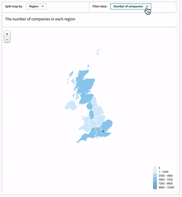
First, we’ve added a host of new data to the map, including number of acquisitions, spinouts, accelerator attendees, fundraisings and grants, in addition to the number of companies that meet your search criteria.
This is the perfect way to visually track your portfolio, whether you’re a university following your spinouts, a fund manager analysing the efficacy of your investment by region, or an accelerator checking up on your programme’s cohort. For example, of the companies that attended an accelerator, how many per region went on to reach the growth stage, raise over x amount, or to be acquired? For a more in-depth search, how does this compare to other accelerator programs?
Make a case for your region
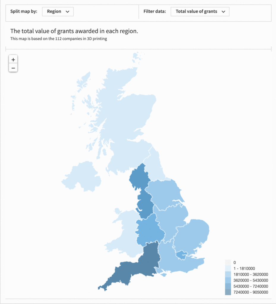
As well as adding more data to the map, we’ve also increased the types of data you can select, meaning you can now see total value (£), average value (£), or percentage, as well as number of companies. For example, as well as seeing the number of fundraisings in a region or local authority, you can look at the total or average amount raised in GBP.
You can then combine this with Advanced Search criteria to select sectors or buzzwords of interest, then choose what data you view: for example, show me the total amount in GBP of grants awarded to PropTech companies across regions within England over the last 3 years. This is a great way to use data to shout about the successes of your local area, and make a case for further investment, or for companies within a certain sector to relocate to your region.
Create professional reports, effortlessly
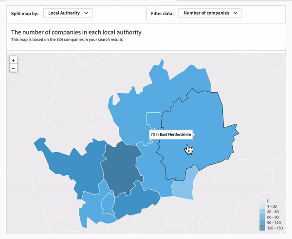
This new version of the interactive map also includes more detailed labels and clickable areas, so you can easily evaluate and compare data between regions. You can stick a label anywhere you like by clicking on the desired point, and select multiple regions at a time.
This, along with the addition of map titles, means you can create clear, annotated diagrams to supplement your professional reports and presentations*. So, for example, effortlessly create an annotated map to complement a report on the effectiveness of investment between different local authorities within your Local Enterprise Partnership.
*subject to the data sharing policy within your Beauhurst agreement. Please contact your account manager before distribution if you are unsure.
Want to learn more?
If you’re a Beauhurst user and have any questions about how you can leverage maps for your business, feel free to reach out to your friendly account manager who will be more than happy to help.
Discover the UK's most innovative companies.
Get access to unrivalled data on all the businesses you need to know about, so you can approach the right leads, at the right time.
Book a 40 minute demo to see all the key features of the Beauhurst platform, plus the depth and breadth of data available.
An associate will work with you to build a sophisticated search, returning a dynamic list of organisations matching your ideal client.